For educators
Free textbooks for the subsurface curriculum, from rock physics and seismic through reservoir simulation to the machine learning the field now runs on. Every figure is a working instrument, and the whole library keeps running after the wifi drops.
Every figure is a working instrument
The library covers petrophysics, rock physics, seismic acquisition, processing and interpretation, geomechanics, reservoir modeling and simulation, geostatistics and statistics, and a full course in machine learning for geoscientists. The mathematics underneath is here too: algebra, proof, analysis.
No figure is a picture of a result. Your students pick the fault, track the horizon, separate a velocity artefact from a real structure, and flood a reservoir they built themselves. One synthetic well, Ogbon-1, runs through several of the books, so the porosity they compute in petrophysics governs the seismic response they model three books later. Our bias, for what it is worth: nobody really understands fluid substitution until a slider has surprised them.
The figures below were recorded from live sections. Open any of them and you get the same controls.
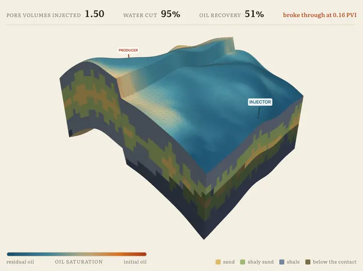
Water into the down-dip flank, oil out up-dip, and the front follows the permeability, racing through the best sand and crawling where the rock is tight. By this point the student has built the structure, the facies, the properties and the wells over seven earlier stages. The flood is the exam, and roughly half the oil stays in the ground.
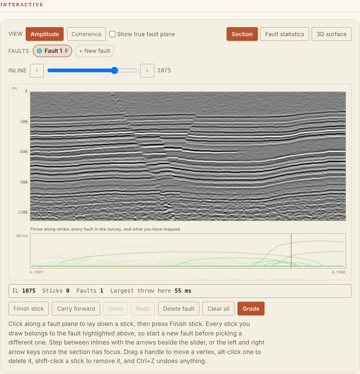
Sweep the inline through the volume and pick the fault where it cuts. The grader measures the signed distance from every vertex to the true plane, so it can separate a pick that scatters either side of the plane from one that sits consistently to one side. Only the second is the mistake this section warns about, picking along the offset reflectors rather than through them, and a grader that just asks whether the line is roughly in the right place cannot tell the two apart.
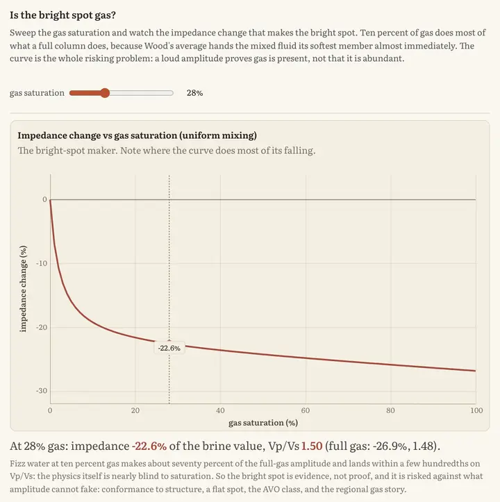
Sweep the gas saturation and watch impedance drop. Nearly all of the drop happens in the first few per cent, so ten per cent gas makes about seventy per cent of the amplitude a full column would. A loud amplitude proves gas is present, not that there is enough of it to sell. This is the figure where students stop trusting bright spots.
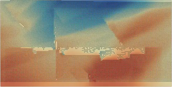
Click once on a reflector, auto-track that line, then carry it forward and regrow it inline by inline. The map underneath builds as you go, from a single pick to 13,512 of them across the survey. The dark dots are picks and everything between them is interpolation, so the map states its own coverage rather than implying it was measured everywhere. Read the sharp line across it for what it is: the gridder has crossed a fault.
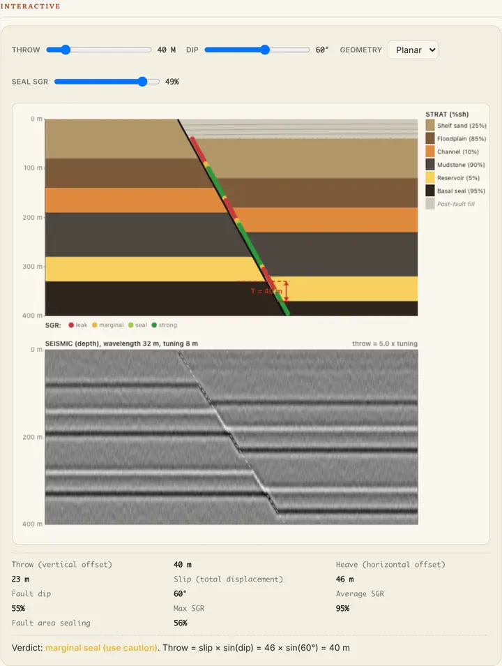
Every point on the fault is coloured by shale gouge ratio, from leak through marginal to strong, and the verdict underneath turns with them. The slider moving here is the seal threshold, which is basin calibration: North Sea practice often uses 20 per cent, the Gulf of Mexico sometimes 30. Raise it and a fault that sealed everywhere becomes one you would argue about. The panel below is the seismic section this same model produces, which is where the throw is actually measured.
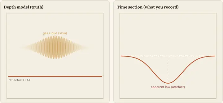
A flat reflector under a slow gas cloud. In depth it is flat. On the time section you would actually record it sags into a low that does not exist, and slowing the cloud further drags it further from the dashed line marking where it really sits. A structure and a velocity artefact, drawn side by side.
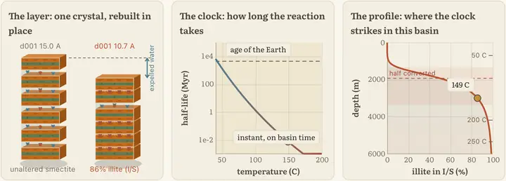
Smectite converts to illite as it warms, and every interlayer that snaps shut around potassium expels the water it was holding. Sweep the geothermal gradient and the transition slides kilometres up and down the section, yet it stays pinned to the same temperature on the scale at the right, because the reaction keeps time in heat rather than in burial. Which is why one basin gives up that water at two kilometres and another at five, and why the depth where the overpressure starts is not a number you can carry between fields.
One of them goes further than the rest. Everything above is a widget computing a result. This one is running an algorithm that the industry books cluster time on.
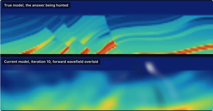
The upper panel is a window of Marmousi2, the field's standard benchmark. The lower one is what the inversion currently believes, computed in the page: a 2D acoustic wave equation solved by finite differences, the residual back-propagated through the exact discrete adjoint of that scheme, and the gradient formed by correlating the two wavefields. No server, nothing pre-computed. Students run it twice from the same poor starting model: inverting the 2.4 Hz band alone takes the misfit down by a third and ends further from the truth than it started, while the low-to-high schedule from that identical start halves the error. A falling misfit is not evidence that an inversion is working, which is a hard thing to teach from a picture.
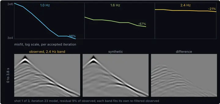
The same lab's instrument panel. Each frequency band gets its own misfit curve, log scale, one point per accepted iteration, and the three drops tell the multi-scale story: the 1.0 Hz band does nearly all the work, and by 2.4 Hz the model is mostly right and the misfit barely moves. Below, one shot gather three ways: the observed data re-filtered to the current band, the synthetic the current model predicts, and their difference. The difference panel is the honest one. It is the thing the inversion actually minimises, and watching it fade toward grey is what a falling misfit number looks like when it is telling the truth.
Machine learning, and where the labels come from
The machine learning here is a course, not a closing chapter. Sixteen chapters run from gradient descent implemented from scratch, through linear and logistic regression, k-nearest neighbours, naive Bayes, decision trees and random forests, feature engineering, the bias-variance tradeoff and dimensionality reduction, and on to perceptrons, convolutional networks, recurrent networks and autoencoders. Every one of them is taught on earth and subsurface data rather than on the iris dataset. A second book covers physics-informed neural networks for exploration seismology, and the statistics the whole thing rests on has a book of its own, as does geostatistics.
Python runs in the page. Students write NumPy, pandas and matplotlib in the browser and it executes there, with nothing to install and no lab machine to book.
The hard part of geoscience machine learning is rarely the model. It is the labelled data. Hand-picked interpretations are expensive, and there are never enough of them to train on. A synthetic carries its labels for free, because the fault in the image is the fault you drew.
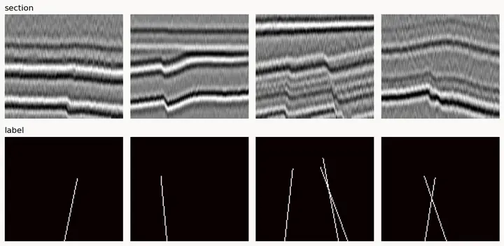
Sections and their labels, generated a batch at a time. The seismic is noisy and the beds are folded and faulted the way real data is, and the mask beside each one marks the faults exactly, because they are the faults the model drew. Regenerate, and again, until the network has enough. This is the notebook running, and it writes the set out as a NumPy array.
And eight notebooks, when the browser is not the point
Some of this belongs in a notebook rather than in a page. There are eight, on GitHub, each opening straight into Colab on the free tier: the convolutional synthetic and the well tie, wedge tuning, AVO and Gassmann for a direct hydrocarbon indicator, azimuthal AVO over a fractured reservoir, the fault-detection training set, a 4D time-lapse over a CO₂ plume, an acoustic finite-difference lab, and a field-realistic section that ties the rest together. Each one is self-contained, needs nothing but NumPy and matplotlib, and generates its own data, so there is no dataset to chase and nothing to license. Assign one as a lab, or lift the code into your own.
The figures here were made by running that code rather than by drawing a picture of it. The earth below is the notebook's own model, with the fold amplitude and the fault throw wound back to zero and grown.
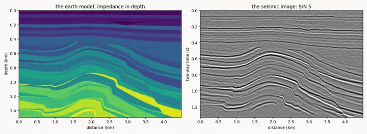
The anticline grows, then the faults slip, and the image on the right follows. Watch the crest plane off against the unconformity as it rises into it, which is how the reservoir sand ends up subcropping right at the top of the structure. Nothing here is drawn: the right panel is the left panel convolved, after a per-trace conversion to time and band-limited noise at survey quality.
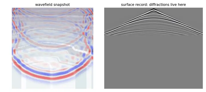
Finite-difference propagation, one time step at a time, with the surface record building underneath. Every discontinuity the wave meets throws a diffraction, and the record fills with them long before anything looks like a reflector. Students who have only ever seen a migrated section find this one clarifying, because migration is the operation that collapses exactly what they are watching accumulate.
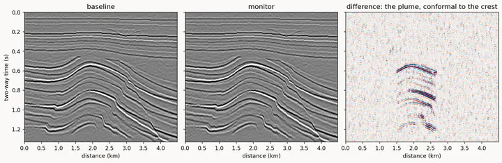
A baseline survey, a monitor survey shot after injection, and the difference between them. The static geology cancels and what is left is the plume, sitting conformal to the crest. The saturation climbs from almost nothing, and for much of that climb the difference panel is only survey repeatability noise. Deciding where along that climb the plume becomes detectable is the whole job, and it has to be done before anyone pays to shoot the monitor.
Guided paths you can assign
A path places a student, then lays out a sequence of sections with checkpoints that grade the work as they go. What accumulates is a ledger of what the student actually did rather than a row of completion ticks. Assign one the way you would assign a reading list; the pacing and the marking come with it.
There is no instructor dashboard yet. Each student sees their own ledger, and you will not see the class at a glance. If that gap is the thing standing between this and your course, write and say so. Instructor demand is what will schedule it.
Practicalities
- Free, with no paywall and no trial period.
- No account needed to read. Progress lives on the device, and signing in is optional; it syncs a student's progress across their own devices.
- Offline once loaded. A student who opens it on campus wifi still has the whole library at field camp and on the bus home. We built it that way because many of our readers pay for data by the megabyte. The one exception is the Python playground, which fetches its runtime the first time a student runs code.
- Runs in a browser on ordinary hardware. Nothing to install, nothing to license.
Using it in your course
The lecture content is licensed CC BY-NC-SA 4.0. Assign it, project it in class, adapt excerpts for your own teaching, all with attribution. Widget share links carry a configured widget into a slide or an assignment page, so you can hand students the exact figure, set the exact way you want them to meet it first.
Browse the library or the guided paths. We also keep a curated guide to free geoscience learning resources across the wider web, ours and everyone else's.
Or start from a live topic your course already covers: fluid substitution, variograms, the well tie.
Send us a syllabus
Mail one to lab@ogbonlab.com and we will build a path to match it, usually inside a couple of days, at no cost. We are a small team, so the person who reads that message is the person who will build the path.